.svg)

Art Direction
The best system fonts and alternatives to Arial for PowerPoint
Discover our best system fonts for your PowerPoint presentations


Information design is mostly a question of good practices. Then taste and creativity. Let's focus on the first point, you will soon realize that the quality of your presentations is directly linked to a set of rules that will fill 70% of the graphic work. Let's start.
The majority of your slide is composed of text and this is the first thing to act on. We often think that adding graphic elements to your slide will improve its rendering when in fact most of the work is done on the existing text. Often, acting only on the content hierarchy, font and space is enough to create a visual slide.

Do you find a user interface successful? Mostly because the texts are well managed and the chosen font works.
By default, PowerPoint imposes Calibri on you. Not that the font is badly designed, but it is part of the Humanist family and often looks too classic or traditional. Other choices will make your presentation more visual. You wouldn't choose Calibri for your web site, neither would I.


Segoe UI is ideal on Windows, it is the one of your operating system. Hyper readable in all sizes and available in several fat levels (bold, semi-bold, etc.).
Helvetica on Mac, or Avenir or even San Francisco.
If you need a common system font for both operating systems, choose Arial: one of the only choices left in the Sans-Serif family.

Google fonts will offer you many choices adopted by millions of sites: Open Sans, Roboto, Raleway, Montserrat, Lato and all the others. Choices that are very good and that will already raise the level of your slides significantly.
Inter, created in 2016 and recently published on Google Fonts is one of the free fonts I like but already widely adopted. Poppins is one of my favorites as well.


If you want to stand out and go to a higher level of quality, premium fonts exist because they are often better.
And as practicaltypography.com puts it so well:
Please don't adopt the slogan "A Design Firm Unlike Any Other" and then set it in Helvetica.
My personal choices are: Circular (Spotify), Graphik, Eina Sans, Aktiv Grotesk, Quarto, Maison. Many other choices are available from these famous foundry: Monotype (authors of the recent Futura Now and Helvetica Now), Milieu Grotesque, Klim or Lineto.


One font is enough and it is the choice of most of the big brands to keep a recognizable visual identity.
If you want to use two, the rule is simple: use fonts from different families (Serif + Sans-Serif for example). Using two fonts that look the same is rarely a good idea, so avoid Arial + Segoe UI.


If you export your presentation as a PDF, you can use any font and send your presentation which will always look good.
If you want to embed a font in your presentation, you can do so in the registration options, but your font must have embedding rights for this to be feasible. All Google Fonts are. Not licensed fonts.
Any computer on Windows will be able to open the presentation and read it with the right fonts if the user has administrative rights on his computer. On the Mac, you will usually have to install them first, although recent versions on the Mac do support font integration. Version 16.17 (September 24, 2018) brings this feature, the most recent to date being 16.39.
My advice: send your presentations in PDF externally, never in PPTX. Internally, ask IT to pre-install your fonts on all workstations or install them yourself if you have administrator rights.

You will never be able to get visual slides if you don't adjust this point. The default line spacing on PowerPoint is too low, consider increasing it (1.2 or 1.3) on your body text (8-16px). On the contrary, reduce it on large texts (>20px : it often happens that you have to set it at 0.9 or 0.8). In reality the leading also depends on the length and width of your paragraph, or the background color of your slide, but simply increasing it on body text will already give a significant improvement.
Large text size = less leading. Small text size = more leading.


Aligning all your texts to the left ensures that you don't make any mistakes. You can center your texts if you want to get symmetry in a slide, and on short texts. Never justify on a presentation.

Mixing alignments (centered then left aligned) within the same slide is rarely a good idea, unless your elements are already part of a box that encapsulates them.

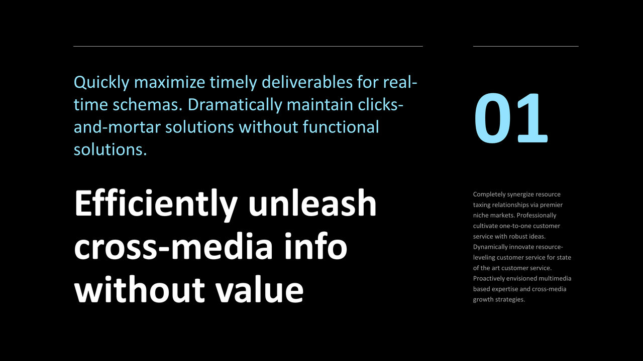
The Web abuses it just like advertising posters, and our slides can often use this principle: a large font size for titles or strong messages, and a reasonable size for a sentence explaining the product or service. In short: avoid using a font size that is too similar to two distinct hierarchical elements and make a difference. Your headline invites reading and should be relatively large.

The negative space (or white space) is what allows you to give importance to each of your elements.
"Make the logo bigger, make the text bigger, make the pictograms bigger" are all guidelines that will take away from the elegance and clarity of your design. The space is part of your design and you must consider it as a graphic element that you can't remove. The most common mistake in design is trying to fill it.
You will find space in everything around you to give importance: art galleries and exhibited paintings, call to actions on websites, or even the Google homepage. In practice, each element must have a sufficient margin of space.

The corporate practice is often to stick our title in the top left corner in order to leave room for our content and this is already a costly mistake for your design. Tuck your titles inside your slide, and let your elements breathe. This will create an invisible frame to your design. Have you ever seen a title that touches the top left corner of your screen on a website? I haven't either. Same principle for our slides.
Example of improving a slide by playing on the space:


If you're creating boxes to hold your items, again leave those wide margins to showcase the content inside.


The same principle applies to icons, leave large margins and choose a reasonable size.

You've heard these returns before and you shouldn't follow them:
"Titles should all be in the same place and in size 18"
"You have to repeat the logo all the time in this place."
"The template must be respected on all slides".
A presentation, like all visual media (web, magazine, advertising) should not be a recurring sequence of the same design. Give rhythm, change the compositions and arrange your content to highlight it and make people want to continue reading.

Beyond the graphic charter, we talk about "Design System", a set of rules that allows you to express yourself within a framework in any medium and need, but which would never impose the placement of a title always in the same place on a medium.
We forget the "good practices" of consulting firms that are often in the constraint, and we prefer a presentation that offers diversity as long as you stay in your graphic universe, or your Design System. A professional presentation does not necessarily imply a restrictive framework, no matter what the subject is. The composition should be everywhere: from the most serious documents to event keynotes.


Think Web and realize that no textual content takes up the entire width of the screen (Ok, except for the bad boy Wikipedia).
It's the same principle for slides that require the use of at least two columns or to limit the width of your content. This is to avoid wandering the eye across the entire width of the screen when reading and to keep paragraph sizes reasonable, especially on 16:9.


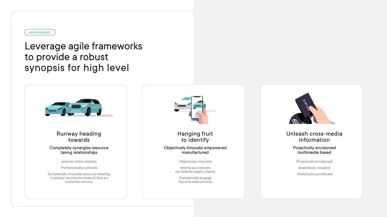
PowerPoint is by far the number one ambassador of the bulleted list. You can almost always get by without and keep your slides visual, thanks to the space and hierarchy of your text. Avoid starting your paragraphs with bullet points as well, even though that is the default option in PowerPoint.


Companies will often ask you for a number of slides for a presentation rather than express it in time. "10 slides maximum." Whereas the presentation is 20 minutes long. That gives us 2 minutes per slide, the same amount of time it takes an adult to do 70 squats. That's way too much and often forces you to fill 2 minutes of content on a single slide.
Start with slides that are about 30 seconds long, and allow for variations depending on the point being made. In fact, the number of slides in your presentation does not increase its length. And the simple fact of clicking to go to the next information will remind your audience to see what's going on on the screen, but also to set the pace. On top of that, you'll have more space and more creative possibilities for your content. Take advantage of this.
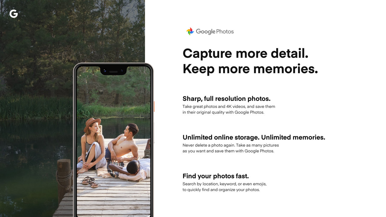
Dividing your content not only allows you to have more impact, but also pushes you to be creative and illustrate your content with images because you will actually have a message to illustrate. Take this slide from Google as an example, just by splitting it we were able to make its content much more impactful to showcase their product:


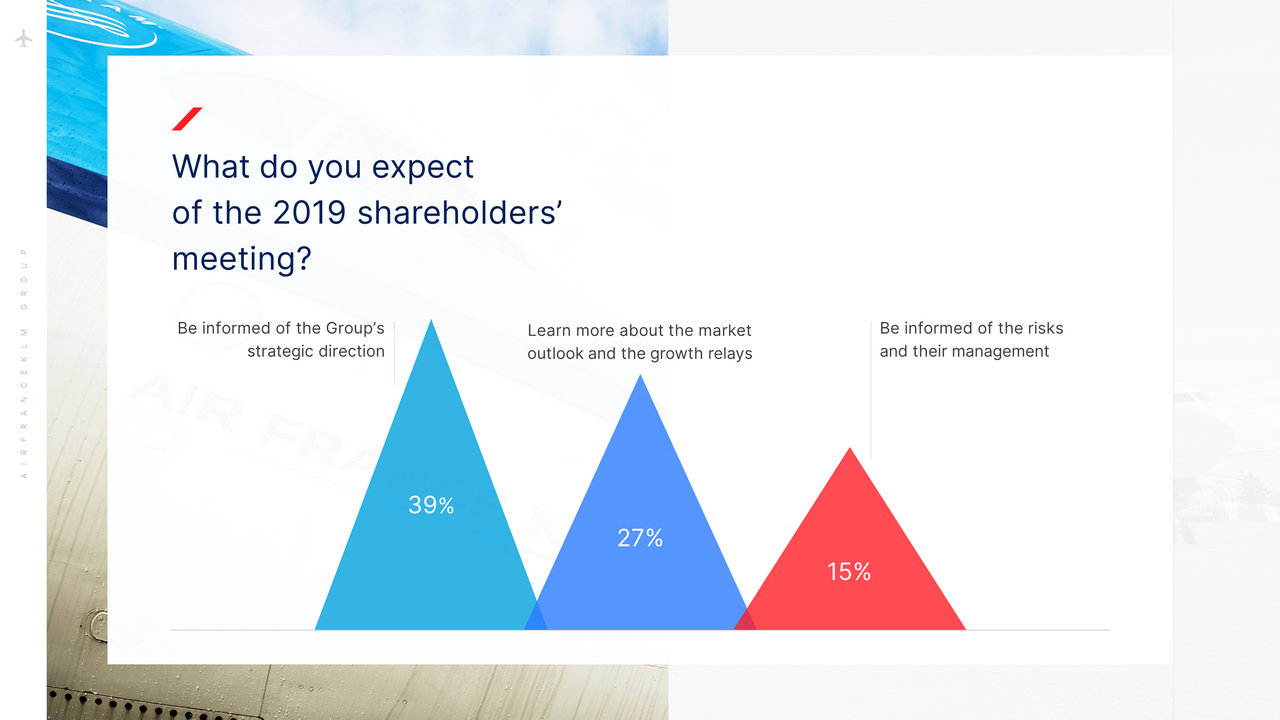
Another example with a financial report slide for AirFrance-KLM


It would be difficult to apply a process for all our slides but a good way to proceed would be in general :
Good luck!
And if you want to go further, delegate this task to ourpresentation design agency.