.svg)

Art Direction
The best system fonts and alternatives to Arial for PowerPoint
Discover our best system fonts for your PowerPoint presentations
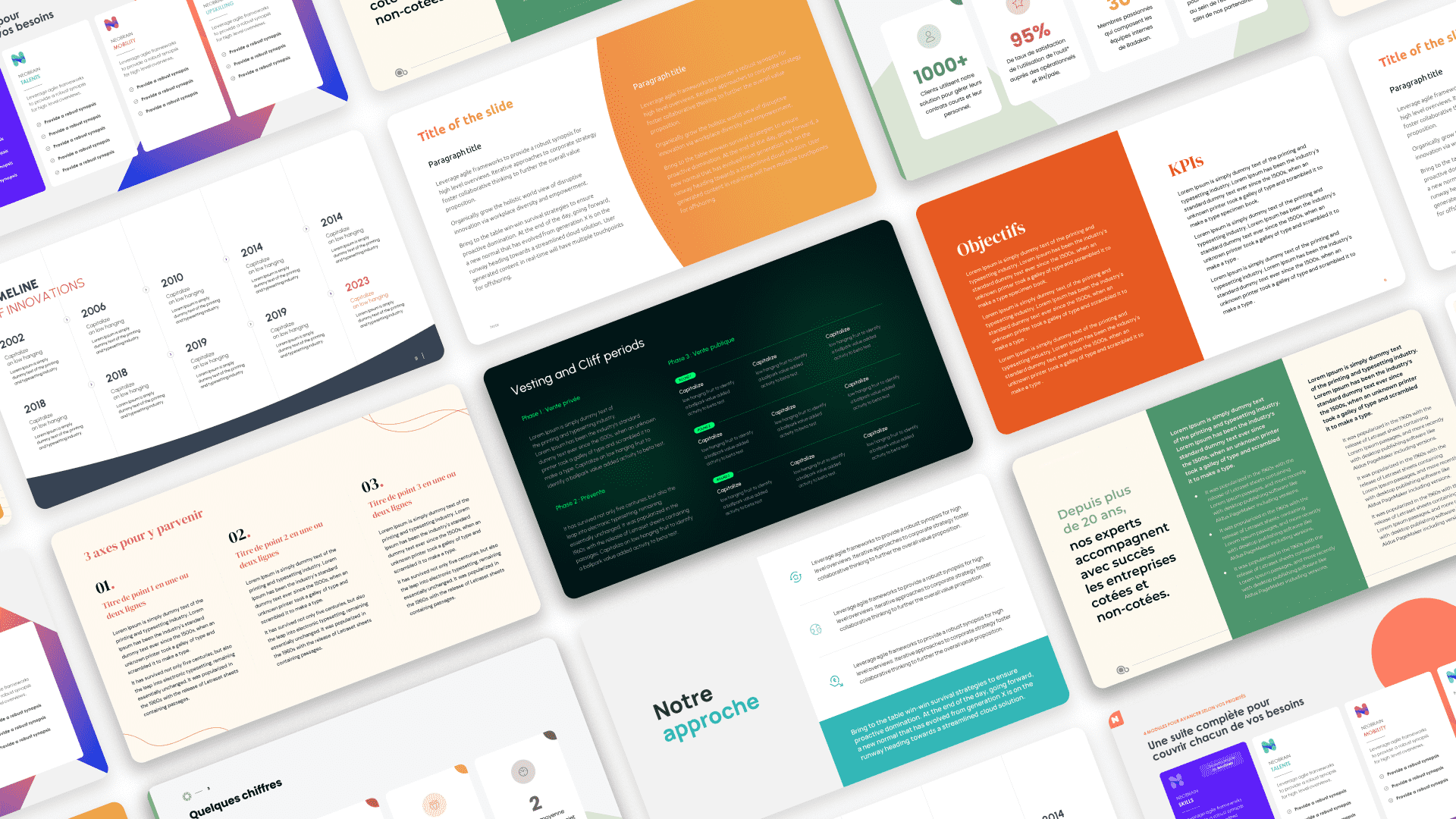

A Powerpoint without any images... You can imagine the hell of a presentation filled with blocks of text with the grace of a Word document. However, although transforming this information into something readable and aesthetic is not easy, it is far from impossible.
Your presentation will be composed of text only. The choice of typography will therefore have a major impact on the rendering.
Since system fonts are not the most aesthetic and give us only a limited range of options, let's go to the Google Fonts site which lists a wide variety of free and royalty-free fonts.
Before making your choice, ask yourself these questions: What is my presentation about and who will I be addressing? You will need to select a typeface based on the content of your presentation. There are an infinite number of typefaces and families, but they can be grouped into four categories:
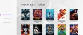
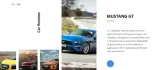
.png)
.png)
.png)
.png)
Good news, Google fonts allows you to sort through these very categories, making your search more efficient. 😎
I would use the "Epilogue" to illustrate this article. Bold for the headlines and regular for the running text. If I were to illustrate my headlines with a serif typeface, I would use a non-serif typeface for the running text (varying font families for different reading levels is a good practice)
So we have our typography. This will have an impact on our slides. Now we just need to know how we are going to make it readable, understandable and finally aesthetic.
Let's start with the understanding part.
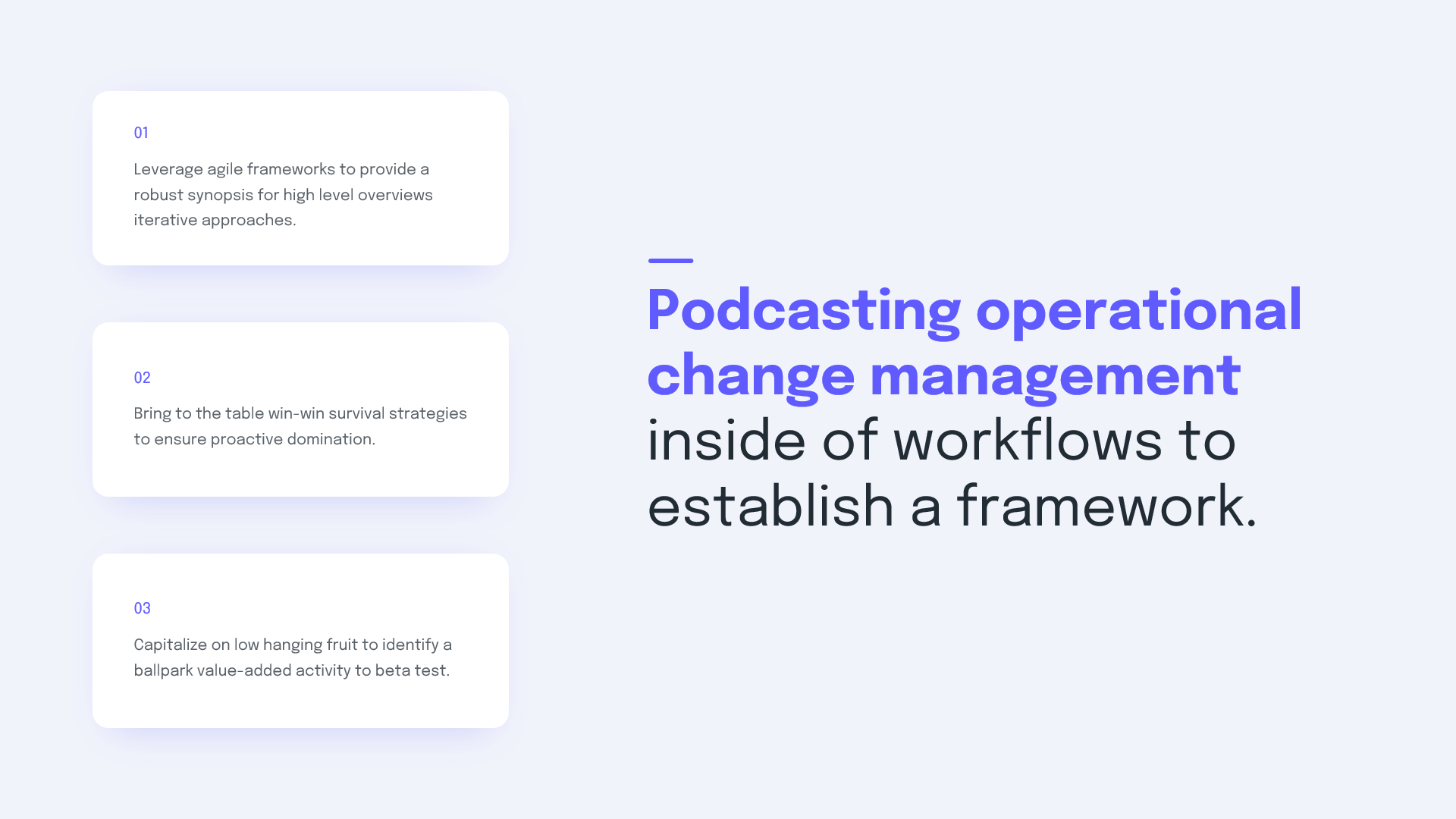
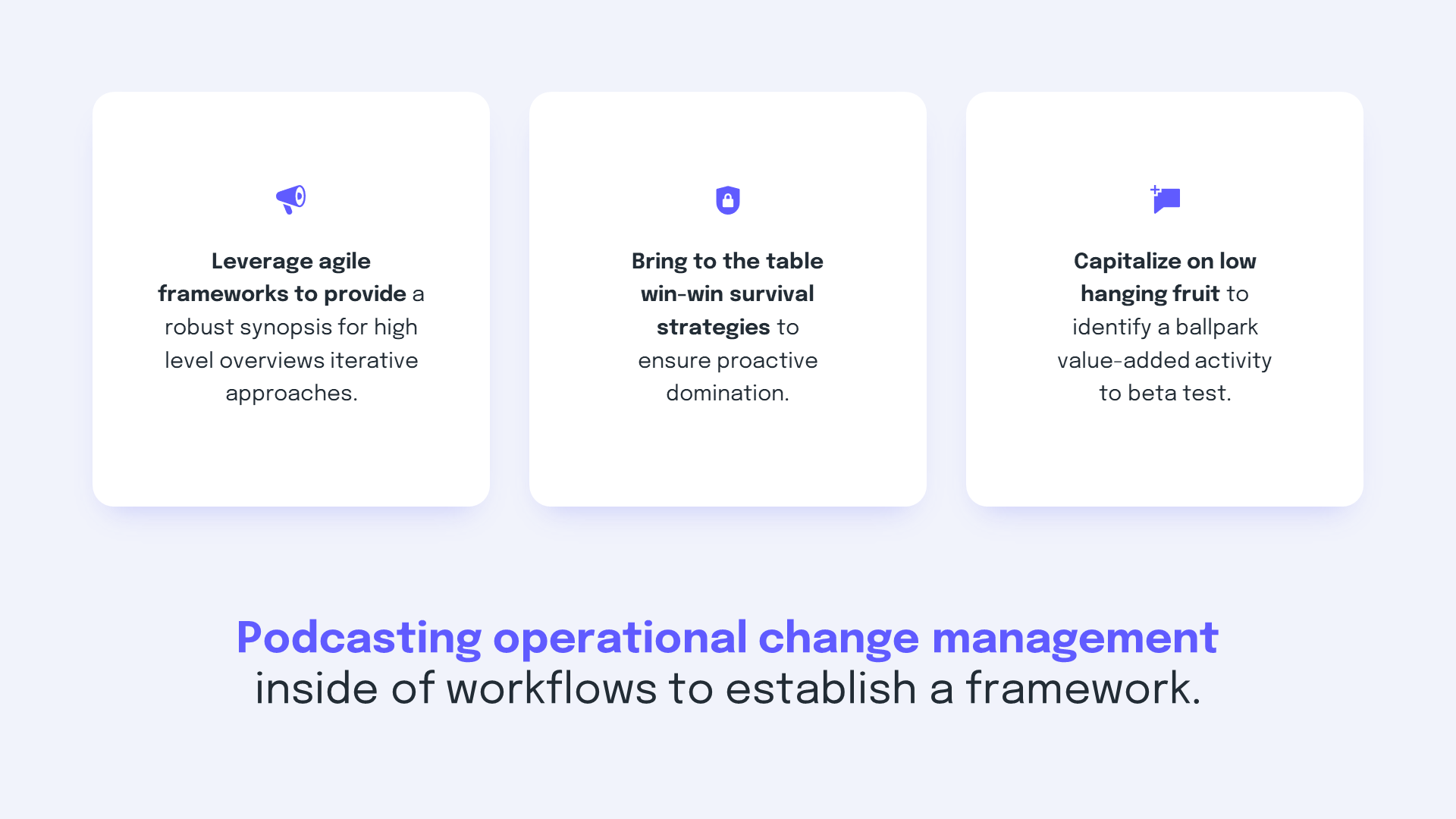
In order for the message/intention of your slides to be understood at first glance, each slide must be designed according to the content it contains. Forget about huge title banners repeating on every slide and focus on the core message.
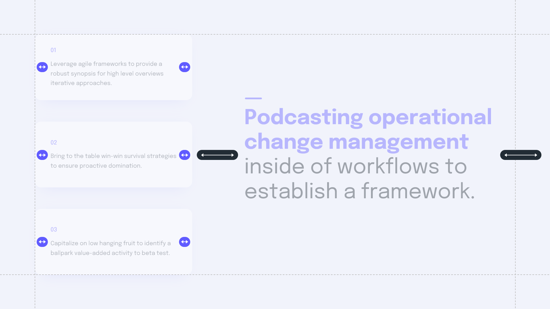
To do this, you must first look at the content of your slides and define levels of importance for each group of information.
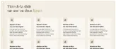
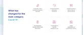
Below is an example of the process up to the finalization.
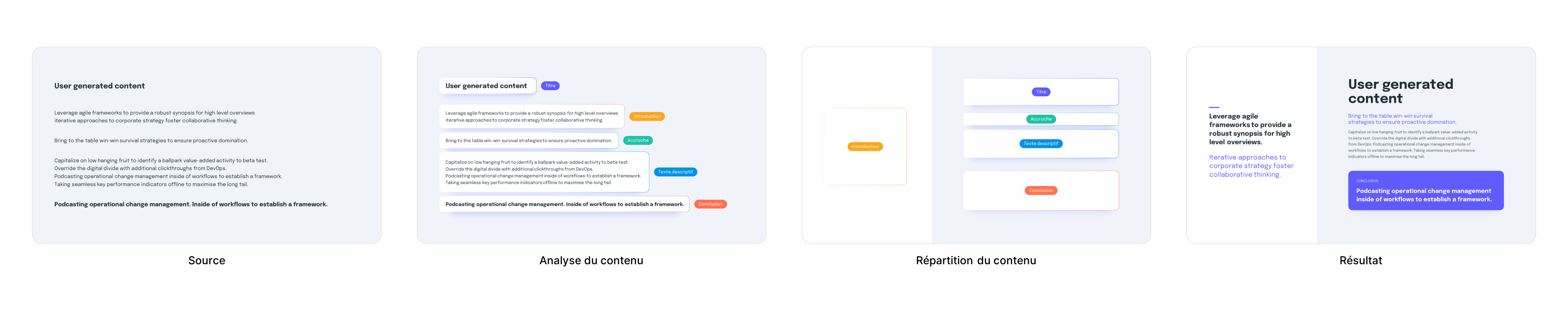
We will now start formatting the content.
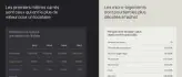
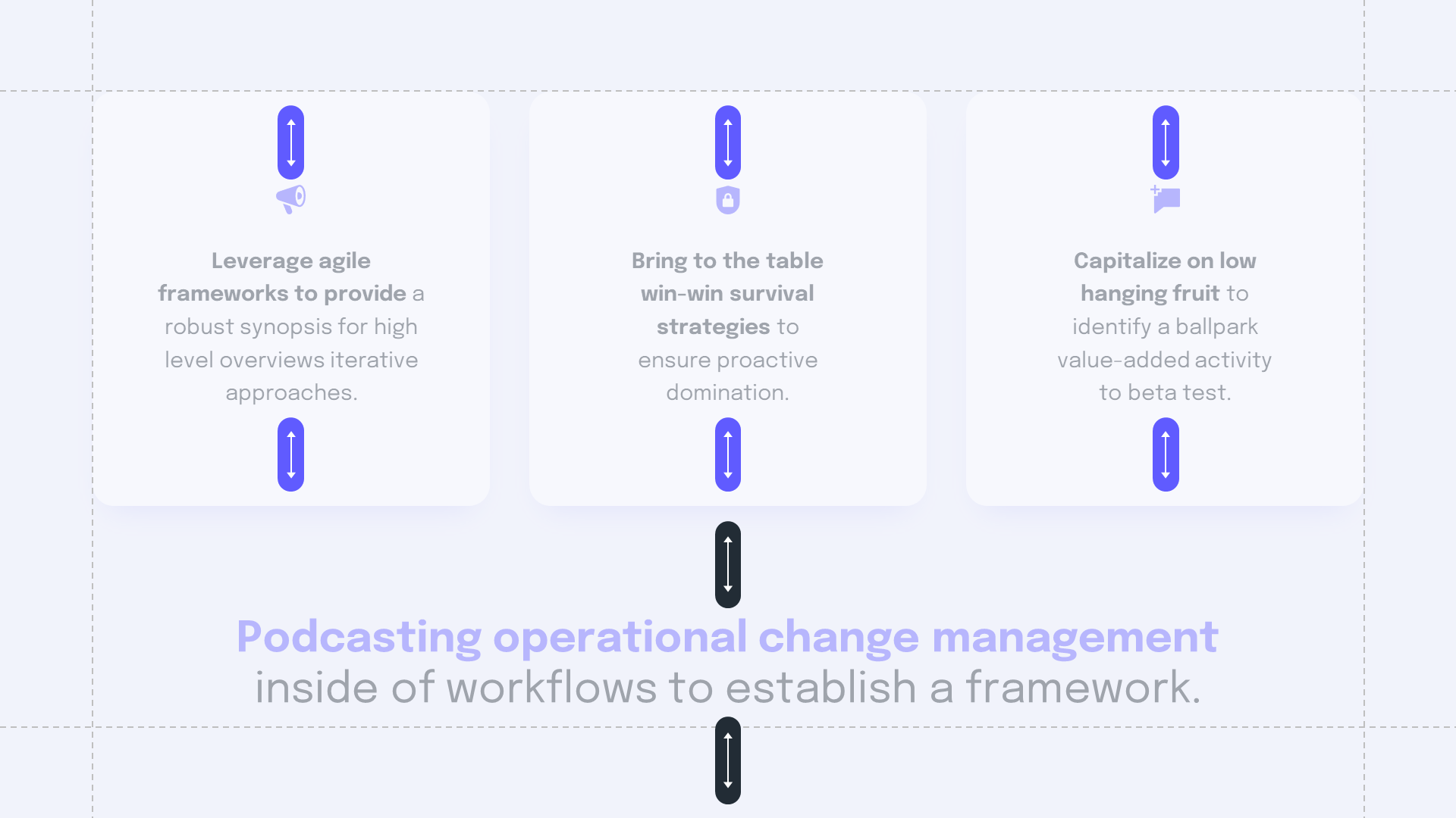
First, keep in mind that a slide overflowing with information is typically what you want to avoid. So in some cases you will need to divide this information over several slides to avoid getting overwhelmed.
Once you have sorted your content into different levels of importance, you can arrange them accordingly. It's up to you to determine which content to highlight and this choice will directly impact the way you organize it.
In summary
It is necessary to understand what should be put forward more or less and according to that, arrange the content in an optimal way.
Now let's focus on the treatment of the text itself and its readability.
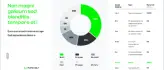
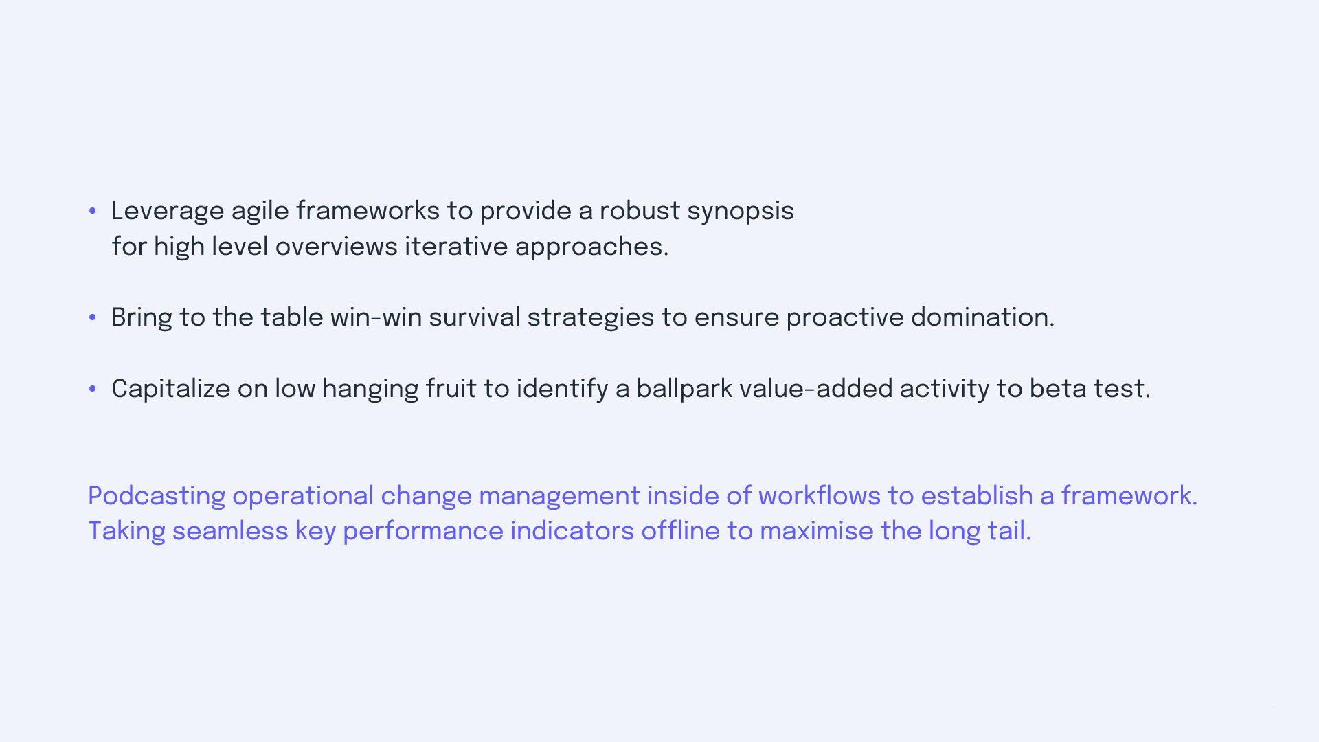
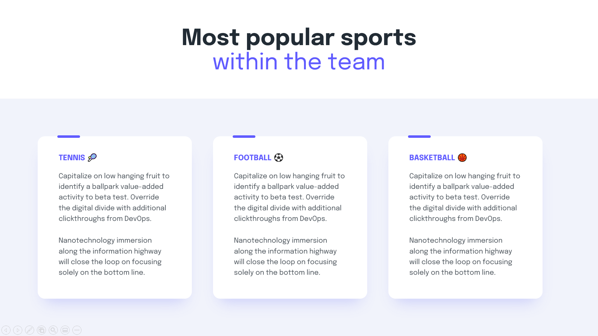
To optimize the understanding of each piece of information, it is essential to define reading levels. The difference between a text and its title must be obvious, so these two pieces of information must be treated in different ways.
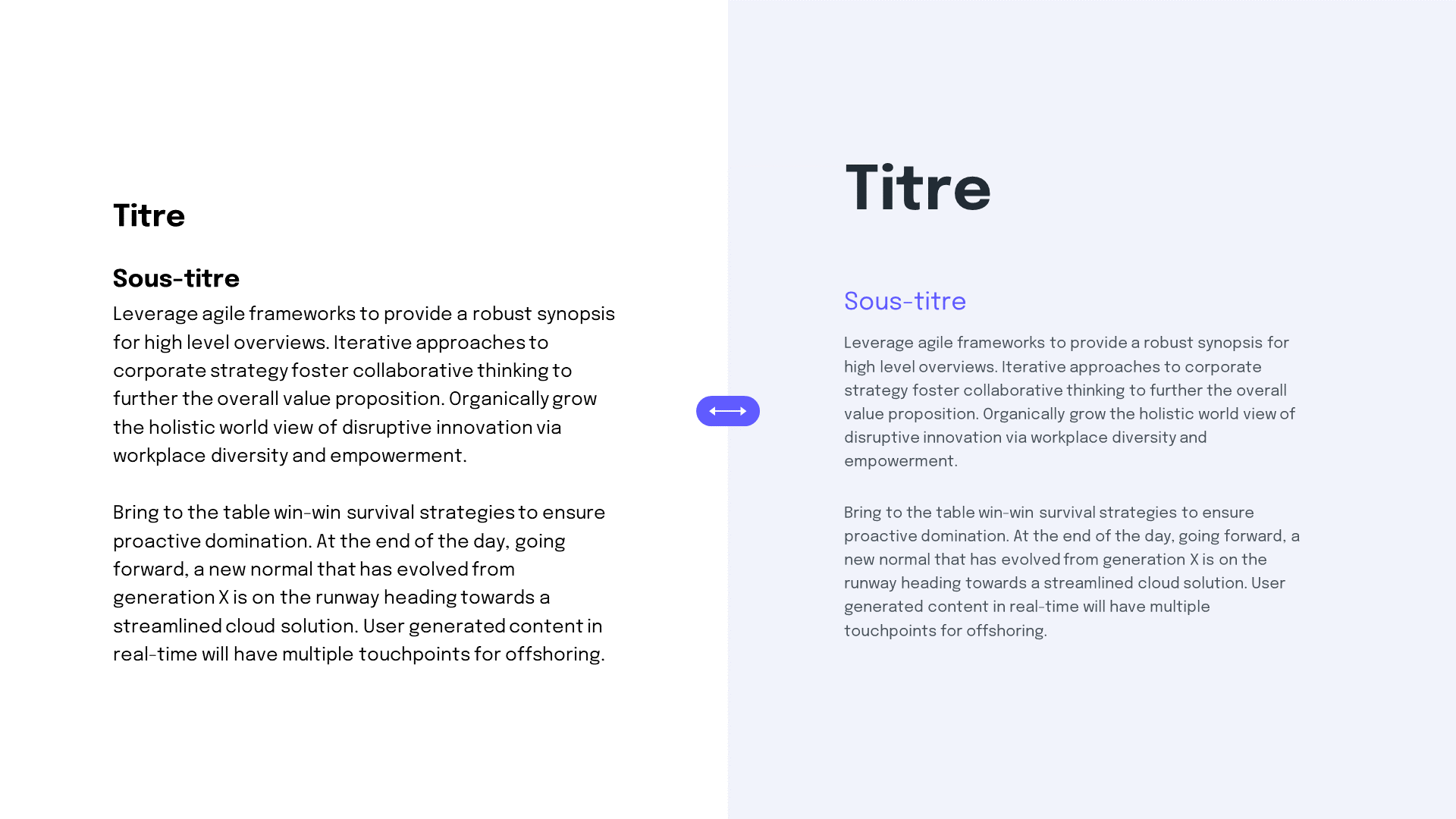
A text block can also become pleasant to read if its line spacing is adjusted. By default, the line spacing of text blocks is too small for regular text. Simply changing this setting will make your lines more airy and give your content more character.
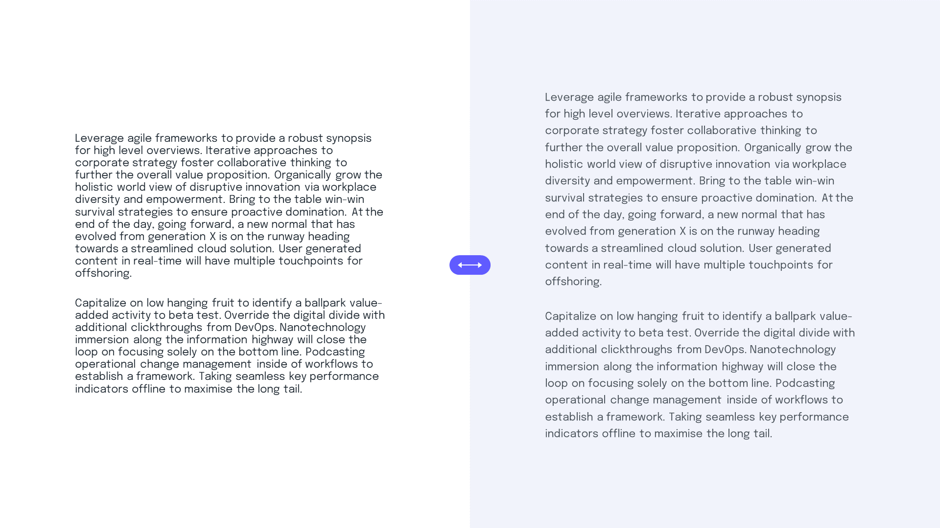
Same thing for the text of the titles, the default line spacing can be too high, it's up to you to adjust it so that your lines are not too far apart, we would lose readability.

In summary
Work on line spacing according to the size of the text and define reading levels.
Aesthetics now. In order for your presentation to preserve a unity in its development, we must impose some rules to respect. (Aestheticism and rigor go hand in hand)
The rules of structure in particular, since placing margins on your presentation will not only allow you to have a homogeneous rendering on all the slides but will also facilitate their design.
Imposing margins within your blocks will also allow them to preserve their unity.
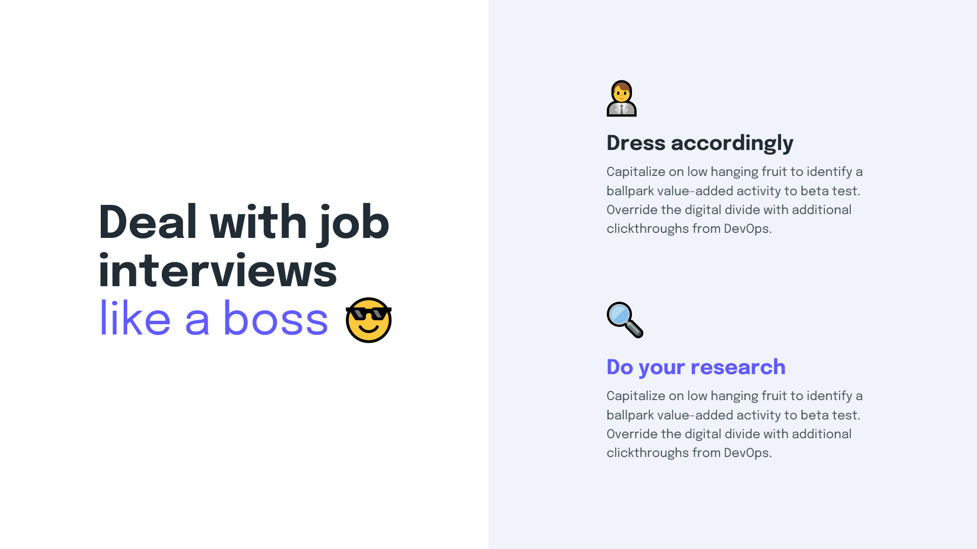
Inserting emojis can be an effective way to breathe more life into content, as long as your positioning lends itself to it.
On Windows, it is very easy to insert an emoji directly into your text via the Windows + shortcut; which is to be used when you are editing text.
This should bring up a panel where you can select the emojis to insert after your text. You can also integrate them into empty text areas in order to use them as pictograms, very practical in this case because they are varied and already installed.

Once your presentation is in shape, you can go further by harmonizing your marketing materials.
You can also request our services ofpresentation design agency.